It’s been just over 3 years since I launched Kettlebell Krusher. Since that time, the site has evolved into more than just a personal blog about the benefits of kettlebells. I’ve come to realize just how passionate people are about getting fit with this awesome tool. Therefore, a redesign & rebranding was necessary to reflect this new direction and inspire others to use kettlebells.
While the name stays the same, pretty much everything else has been altered for improved appearance, accessibility, and user experience. It took me several months to completely redo every post and page that I’ve built over the years. This was definitely not a quick import & reskin job. Keep reading to find out why this change needed to happen and what’s different.
Why I Changed Everything
When I started this website I really had no plan in regards to aesthetics. For the most part, when it came to graphics, fonts, and color scheme I designed as needed. I’ve always considered myself more of a coder than a designer – more concerned with bells and whistles than flow and appearance.
Choosing features and styles that I thought looked cool has led to a complex mess. For example, some font headings differ wildly from one another with color, capitalization, boldness, etc. Text on images aren’t as crisp at certain resolutions and they also get cut off when embedding on social media. It’s not the worst-looking site, but things are all over the place.

Visual aspects aside, I wanted a new site that would attract an international audience. Never in my wildest dreams did I expect to have traffic from all over the globe. Sure, most of the visitors are from the U.S. but seeing different country flags pop up on Google Analytics is really flattering.
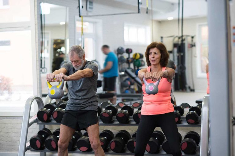
I also felt like the site had that typical macho feel that you would see on men’s fitness websites. The truth is, kettlebell training is prevalent across a wide demographic. Many men, women, and people of all ages and fitness levels have come to embrace the kettlebell. Hopefully, I’ve achieved the goal of a stylish and modern look that appeals to the masses.
What’s Changed
For those of you who’ve visited my website before, it should be quite obvious. Other than the content, the entire structure of the old site has been scrapped. My emphasis for the redesign was to keep things simple and have pages load quickly. Running some tests on Google’s Pagespeed Insights shows a huge improvement in scores. Pretty much every page gets a green (good score) on desktop and a high yellow (moderate) score on mobile.
I tried my best to get mobile scores in the green too but it just wasn’t possible without sacrificing user experience. It still loads very fast on mobile, however, Google uses a poor connection to grade scores on those devices. The point being, unless you’re trying to load the website in the remote wilderness it should be a smooth experience.
I won’t cover every little detail that’s changed but I would like to discuss the important ones. I’m quite proud of the way this redesign turned out. Time will tell if all this effort will pay off in increased rankings and returning visitors. Below are some of the most notable changes and differences from the old website to this new one.
Dark Mode
Perhaps the biggest gamble of all is choosing a dark mode theme for the site. I prefer this style in all of my apps and so does my wife. I’ve done plenty of research reviewing poll data where others overwhelming agree. Of course, not everyone is a fan of dark mode which is why I’ve included a toggle button!

Conveniently located on the navbar, the style switcher will activate and save your preferred mode. From what I’ve read most people polled favor dark mode, then toggling depending on light or time of day, and finally a light theme. Initially, I thought about just going straight up with a dark theme. However, I didn’t want to neglect a portion of my visitors and decided that adding some extra CSS was worth the time.
Not everything switches to a light theme. The header, footer, and some widgets (mostly product boxes) will remain dark. The main body and text of pages and posts will change on the fly which is what I suspect people care the most about.
Logo
There are two major differences between the new and old logo. I altered the initial design to have a grey color in its entirety. No more split color scheme of dark grey and red. Secondly, to honor my global audience the kettlebell icon now has a picture of the earth in it. Yeah, the kettlebell came to prominence in Russia but it is slowly gaining traction all over the world!
Visitors on desktop and laptop will notice that the logo spans the entire width of the content space. It’s huge! It also looks pretty sharp on mobile too. Don’t worry though, as soon as you scroll it becomes hidden freeing up more screen space for content. You’ll have access to all that you need with the navbar for a better user experience.
Images
I went through every post and in most cases replaced the image entirely or found the same image and removed the kettlebell category text. Now, when you browse through the blog roll you’ll see a nice square image and can share it without it looking like crap. JPEG compression tended to blur the text anyways which gave those images an awful fuzzy look.
The undesired effect of cumulative layout shift should also be non-existent now too. That’s when you first load a page and content shifts down as photos are properly sized. It’s annoying as hell and difficult to completely eliminate. It’s funny because I had to retrain myself to manually add width and height attributes in source code rather than CSS. This was a big no-no back in the day but is now preferred with the advancement of browsers.
Accessibility
I racked my brain trying to come up with a way that would make it super easy for visitors to access an important feature on certain pages. The solution was to attach a special bar right under the nav that stayed fixed while scrolling. Such features include jump or anchor points to go to important sections on that page. The kettlebell workouts page is a great example to show how useful this may be.
Mailing list sign-up forms are another thing that I’ve integrated into this bar. I got the idea from ConvertKit which just asks for first name and email address. Those fields are short enough to fit in a row on a mobile screen. So if you’re reading a page about a kettlebell challenge or workout plan and want to sign up, no longer do you need to go to the bottom of the page. You may fill out the form at any point without losing your place!

Link Transparency
I’m a member of several affiliate programs and get a commission on certain sales from products and services that I link to. On the old website, all of the hyperlinks were a standard red color. The visitor may not have any idea where clicking would lead them to. I’m not only just trying to cover my butt for FCC compliance purposes but I want people to know exactly what to expect when clicking on a link.
As such, I developed what I’ve dubbed as the Christmas Color Link Scheme because it reminds me of Christmas lights. Red links or buttons will always lead to another page on Kettlebell Krusher (internal link). Blue links will go to an external link in a new window. These are used for informational or source purposes.
The green links and buttons are the money links, get it? Those are my affiliate links. I’ve even added text with a green background over images that link to products and say something like “Available on…”. It might be confusing to some new visitors but after a few clicks they will catch on.
Speaking of affiliate links, I’ve added a shop page that displays the current best-selling products on Amazon that are available. It’s always been a constant struggle dealing with vendors who are out of stock or discontinue kettlebell items. The shop page is not perfect but if you’re looking for these items that page should show what’s in stock.
Looking To The Future
Even though there’s nothing extravagant design-wise about this site, it took a lot of patience to see it through to the end. I’m really hoping there won’t be a need for a Kettlebell Krusher 3.0 for a long time yet. I very much want to be an authoritative resource for all things kettlebell. I enjoy opinioning on news articles about them, doing interviews with prominent people, and still detailing my own personal journey.
While I may be competing with other kettlebell websites, those that share the same passion have the same common goal as I do. That is to share the knowledge about how kettlebells have the potential to change your health and physique quicker than anything else. Now that this redesign is finished I can get back to creating insightful content to help accomplish that goal.